Ready for a digital future
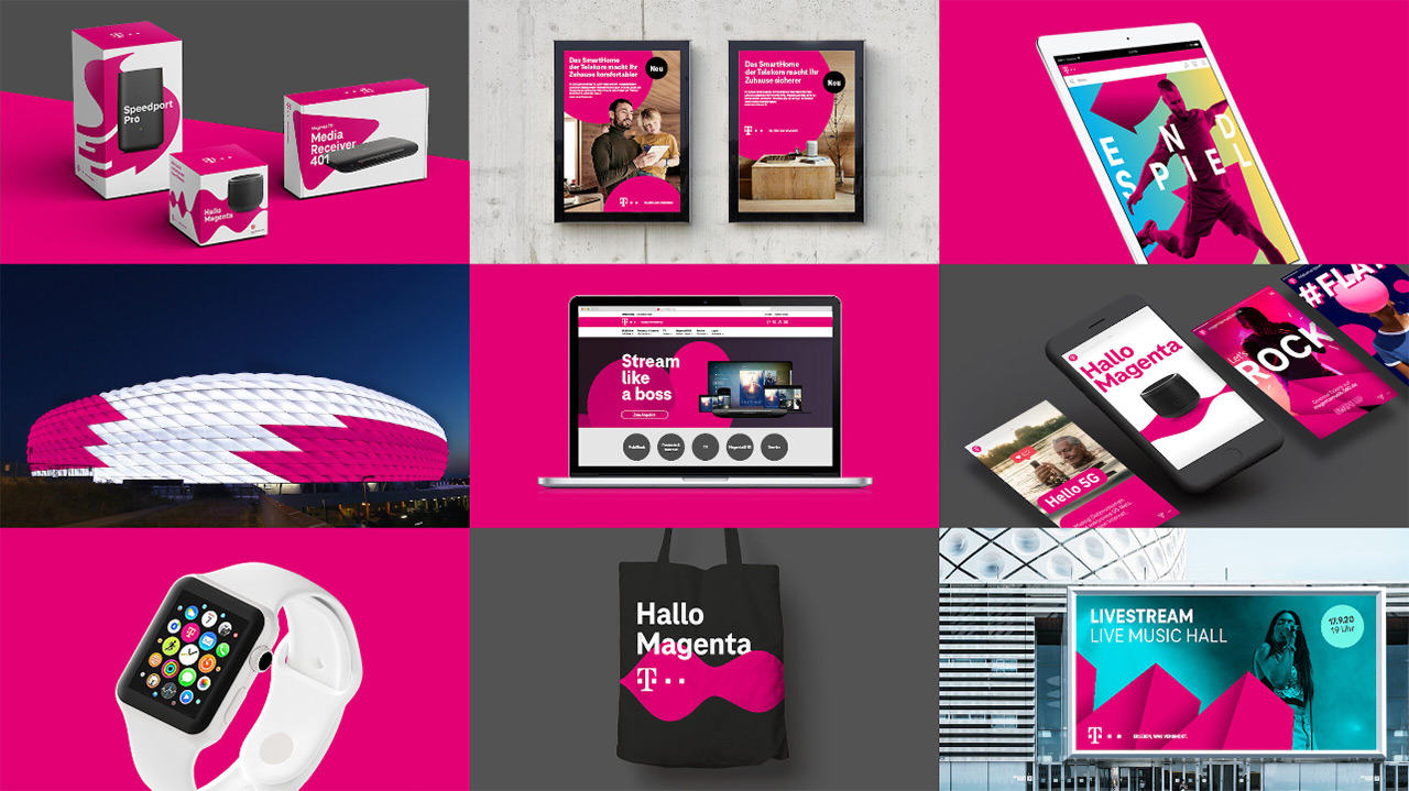
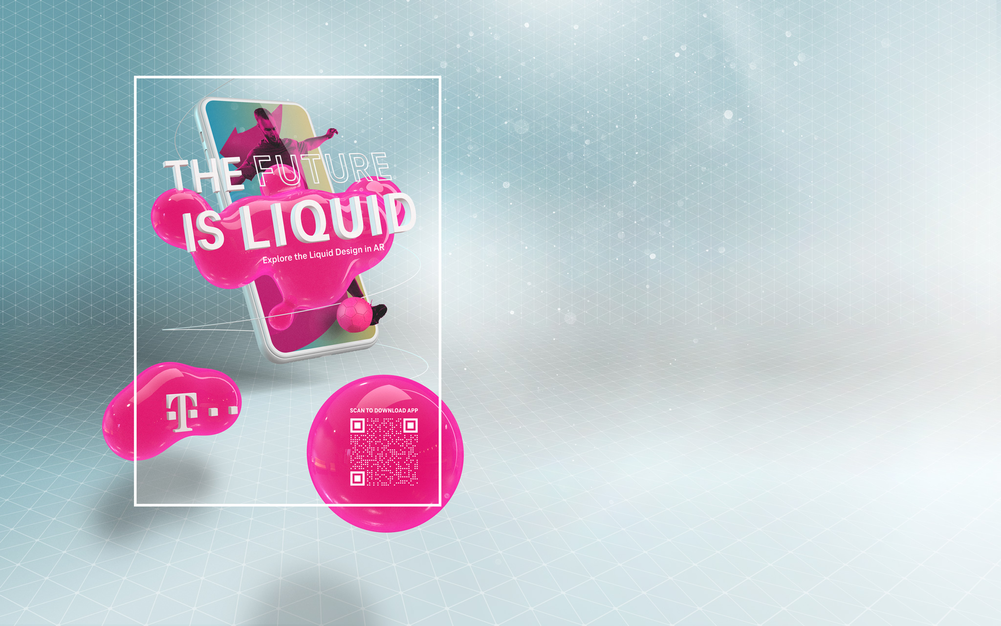
Brands need to continuously reinvent themselves in order to stay relevant to their customers. Leveraging new touchpoints and technologies like Augmented and Virtual Reality is just one way of achieving this. Additionally, we see that our brand must be able to adapt to an ever increasing number of different contexts while also staying uniquely recognizable.
To address these challenges, we need a design system that can adapt to every situation yet still unmistakably represents Telekom at every touchpoint.
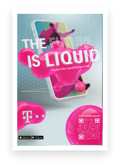
Our Liquid Brand Design is based on these two key aspects: flexibility and recognition.
We ensure harmony here in an overarching system consisting of fixed and flexible brand elements.
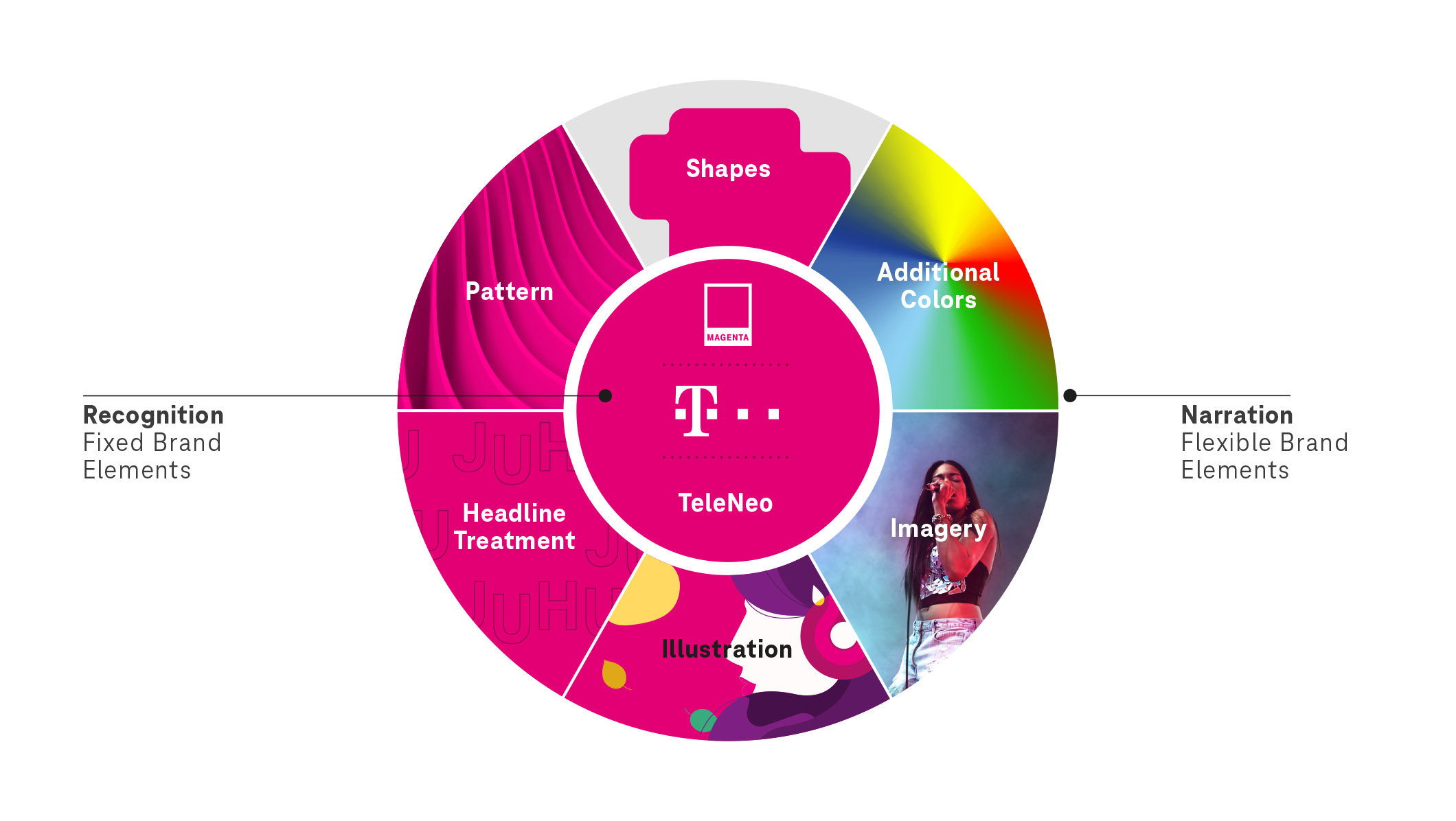
Fixed and flexible brand elements
Our color magenta, the T logo and our typeface TeleNeo are the visual constants in the brand design. As strong and well-established assets they ensure recognition at all times.
Flexibility evolves through creative latitude regarding forms, additional colors, imagery, illustrations and the use of typography. They offer the needed variety to realize the design and communication for all given contexts. This is how we can consistently create new emotional stories and relevant experiences, bringing the brand on track for the future.
